


Ohio School Data Consultant
 I am an experienced Ohio school data consultant specializing in school data analysis and visualization. Today, districts have no shortage of data. Enrollment, Attendance, Discipline, High-Stake Testing, Intervention, and Short-Cycle Assessments are just some of the data elements that schools track each and every day. But what to do with all of that data? I help Ohio school districts make sense of their data. I might work with the district to create an engaging drill-down data visualization for a Board presentation or analyze an intervention program (Data Analytics) to see if it is having an impact on student achievement.
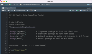 Almost all of my projects start with R and R Studio. These tools allow me to extract data from data sources, load CSV and XLS files, and then clean, combine, normalize, and prepare data for analysis through something called “data wrangling.” This is generally the most time-consuming part of any analysis project, and it requires the most thought and discussion with my clients. The best part about using R Studio is that my projects are easily updated and customized for different clients. Work on NWEA in one school district is easily portable to work in other districts, saving both time and money.
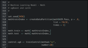 My initial data analysis for all projects continues in R Studio. The first step in any analysis is called EDA, or Exploratory Data Analysis. This step looks for things like missing data, outliers, mismatched formats, and overall data set management. After EDA is complete, a more in-depth analysis takes place for things like correlation, trends, and statistical significance. The more in-depth predictive analytics projects use machine learning, regression, and modeling. All of this work is done in R. You can see some of my analytic projects on my Blog.
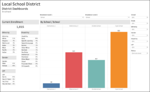 After the data analysis is complete, I then move to visualizations. This is where all of the hard work in the previous steps comes to life. Having tools such as Google Data Studio and Tableau give my customers the best of both worlds. Tableau offers best-in-class data analytic capabilities, including parameter- and filter-driven visualizations, dashboards, and an extremely powerful and flexible calculated field programming language. However, Tableau is expensive for schools, and it is nearly impossible for most of my customers to afford making their Tableau visualizations public. Google Data Studio is free for schools to use, and can be an extremely attractive option to make certain visualizations public. You can see some of my visualization projects on my Blog.
You can see some of my recent work on my Blog. When you’re ready, Contact Me to get started.