Most, if not all, of my Tableau charts contain a mixture of filters and parameter-driven variables with which end-users can drill-down and visualize their data differently. It really does allow for a much more powerful experience with one Tableau chart.
For example, consider this Enrollment chart for a school district. It looks fairly standard, with a set of filters along the right. These filters control the data that populates in the Tableau chart. So far, nothing crazy.
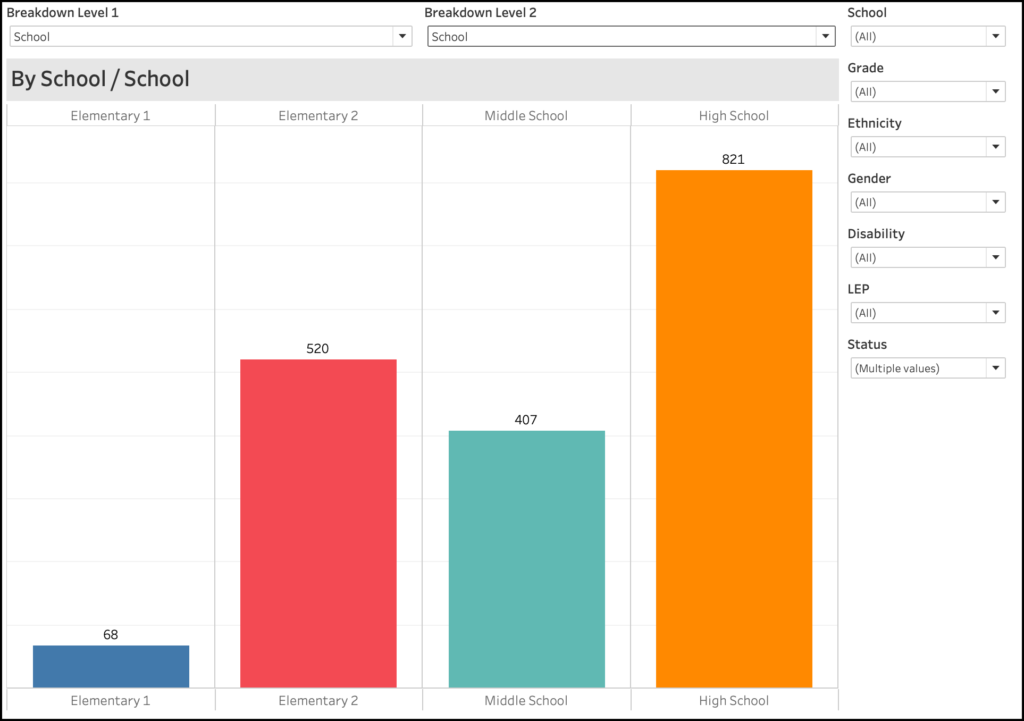
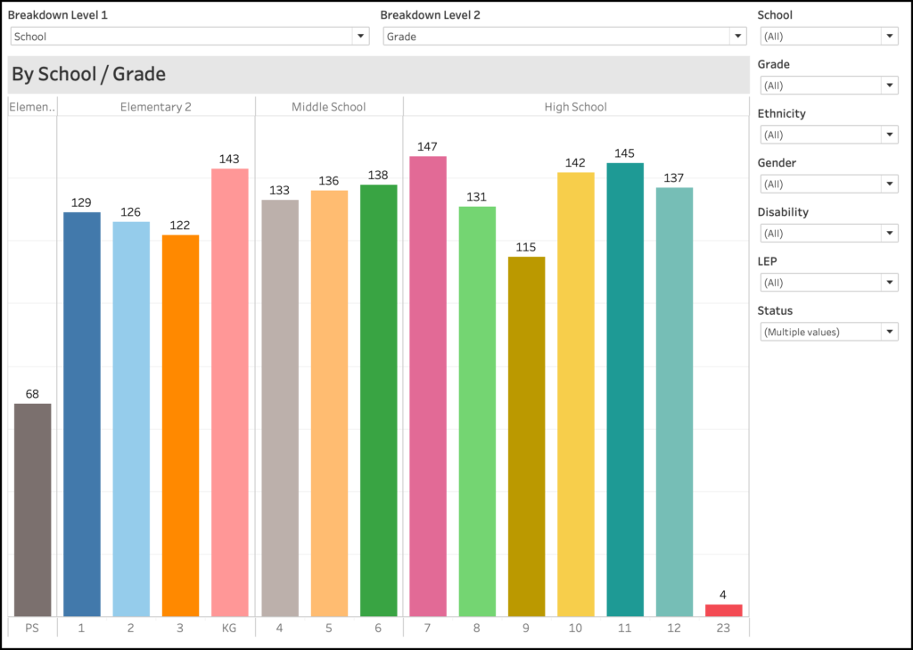
However, take a look at both the title of this chart as well as the drop down boxes just above, titled “Breakdown Level 1” and “Breakdown Level 2”. They are both set to “School”. Now look at the title of the chart – it says “By School / School”. You might be wondering why School is listed twice. If you look at the top of the chart, you’ll see a list of schools (Elem1, Elem2, Middle, High). You’ll see the same list at the bottom. These drop-down boxes are called “Parameters” in Tableau, and they are extremely powerful when building drill-down charts.
Creating the Parameters
First things first – let’s create the parameters in Tableau. Each of them are identical, so I’ll just show you one of them.
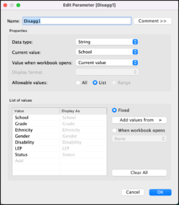
If you look at the parameter screen, you’ll see that it’s set up as a “String”, the current value is “School” (which is the default value).
Next, look at the list of values. These are the different options that I want to be able to drill-down in my chart. I chose School, Grade, Ethnicity, Gender, Disability, LEP, and Status. These are from my data set.
Creating the Calculated Fields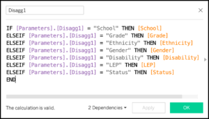
Next, let’s create the calculated fields.
If you look at the formulas on the right, you’ll see that I first check to see what value has been chosen in the parameter drop-down list, and then I set the value of the parameter to the field that has been selected. It is important to note that I’m not setting the calculated field to a text value – I’m setting it to the actual field. In other words:
IF [Parameters].[Disagg1] = “School” THEN [School]
is very different than
IF [Parameters].[Disagg1] = “School” THEN “School”
The former sets the calculated field to an actual field in the table, where the latter sets the calculated field to a text value. This will be very important in the next step.
Adding the Calculated Fields to the Chart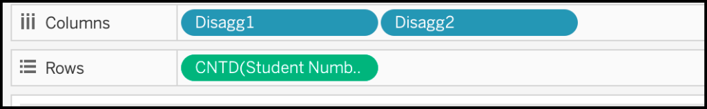
Now that we have the calculated fields created, we just add them to the Columns shelf in Tableau, as shown on the right. We stack the calculated fields one after the other to create the nested drill-down feature of the chart.
Adding the Calculated Fields to the Title
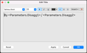
Let’s now change the Title of this chart to reflect what the parameters are set to. Double-click on the title, and then use the “Insert” button on the right to choose your parameters. Use the text to make your title complete.
Using the Parameters
Now that we have the filters and parameters added to the chart, let’s see what they can do! Let’s start from the image above, but change the “Breakdown Level 2” to be “Grade”. You’ll see that (1) the chart updates to add the grade level breakdowns at each of the schools, and (2) that the title now reflects this updated view.
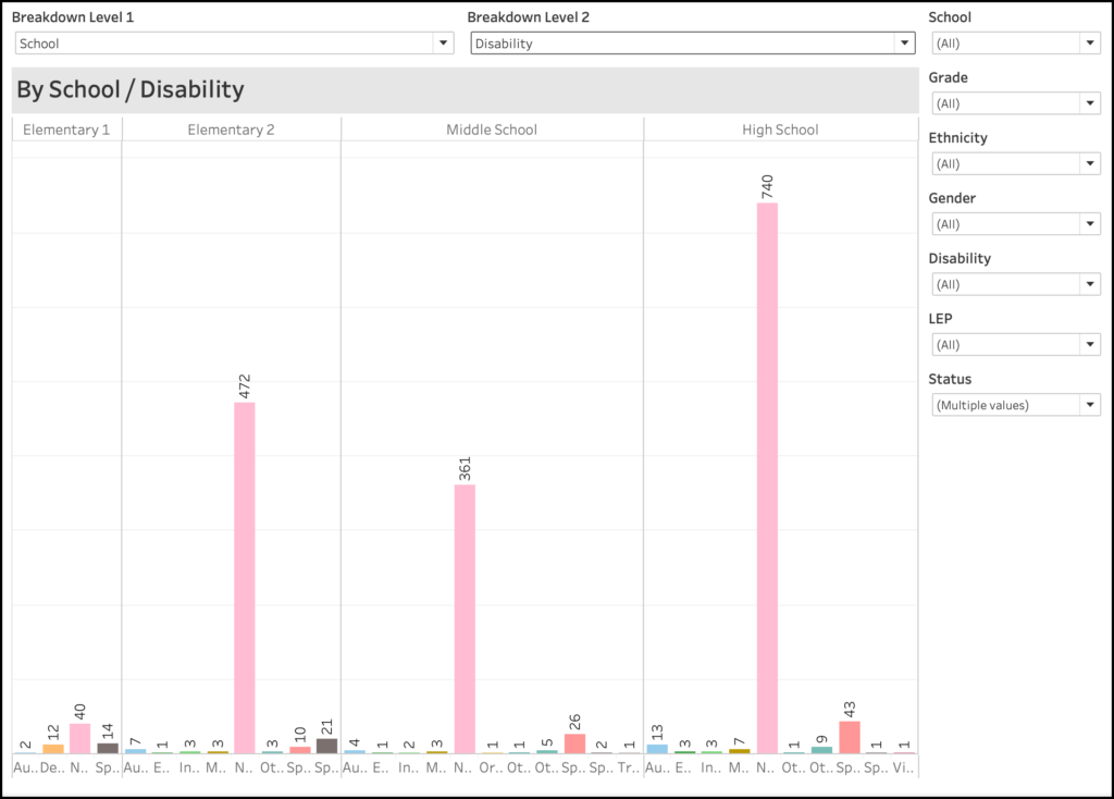
Let’s do the same thing, but change “Breakdown Level 2” to be “Disability”. You’ll see that the disaggregation changes to Disability. This is very difficult to read, because the value of “None” is disproportionately large compared to the other values. So let’s change that.
Using the Filters and Parameters
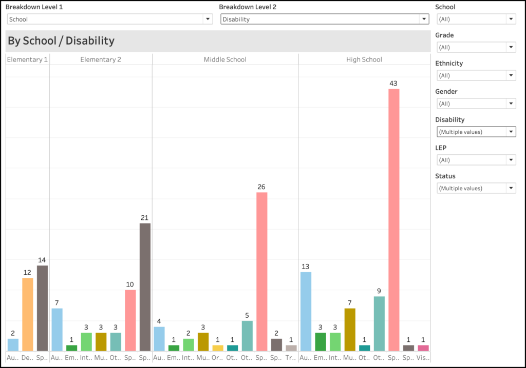
To remove the “None” value, use the filter in the upper right to de-select the value of “None” from showing in the filter. You will now get a much better representation of the various disabilities at each of the schools.
Summary
The combined use of parameter-driven calculated fields and standard filters can give your Tableau charts a much broader use. Rather than creating 10 different graphs on a dashboard to represent 10 different combinations of variables, you can create on chart and allow your users to drill down, aggregate, disaggregate, and filter the data to their heart’s content. You can also use this to lead them through a guided analysis of the data.