As most of us in the Ohio school data analysis world understand, “proficiency” is King. That is, whether a student is performing at grade level, and more importantly, what percentage of students are performing at grade level. For better or worse, this measure is how we are graded, both by internal and external agencies. It’s what the local papers use as a gauge of our success, and it’s what parents and stakeholders use as evidence of our performance as a school district. While it is certainly an important aspect of what we do, I think it is very dangerous to only consider this single measure. To try to avoid this, whenever possible, we look at a student’s growth in addition to their proficiency. While there are various ways to do this, thanks to an enlightening talk at the STATS-DC conference by Dr. Tracey Severns, we will be using a very simple method to review this data with our teachers this year.
Below is a simple chart that we put together for our teachers to use in reviewing their data from last year. This has a fictitious “Teacher 4” noted just for training purposes.
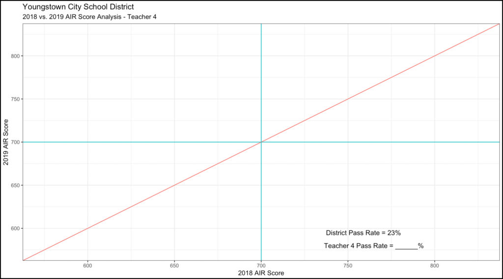
The horizontal axis is a student’s 2018 End-Of-Year test scaled score. The green line at 700 indicates proficiency (greater than or equal to 700 is proficient). The vertical axis is a student’s 2019 End-Of-Year test scaled score, and again, the green line indicates proficiency. A single point on this graph includes the 2018 score plotted on the horizontal axis and the 2019 score plotted on the vertical axis. A student with a 700 on the 2018 test and a 700 on the 2019 test would have a point plotted at the center of the graph or the intersection of the green lines. The red horizontal line indicates growth. That is, points plotted below and to the right of the line indicate students who had a higher 2018 score than their 2019 score, or students who showed negative growth. Similarly, points above and to the left are students who showed positive growth (2019 score greater than their 2018 score). Points plotted directly on the red line showed neither positive nor negative growth. For comparison purposes, we also add the district proficiency rate to the graph.
During a recent district in-service, I presented four fictitious teachers and their data. These data points are fabricated to aide in data exploration and discussion.
Teacher #1 – High Growth / High Proficiency
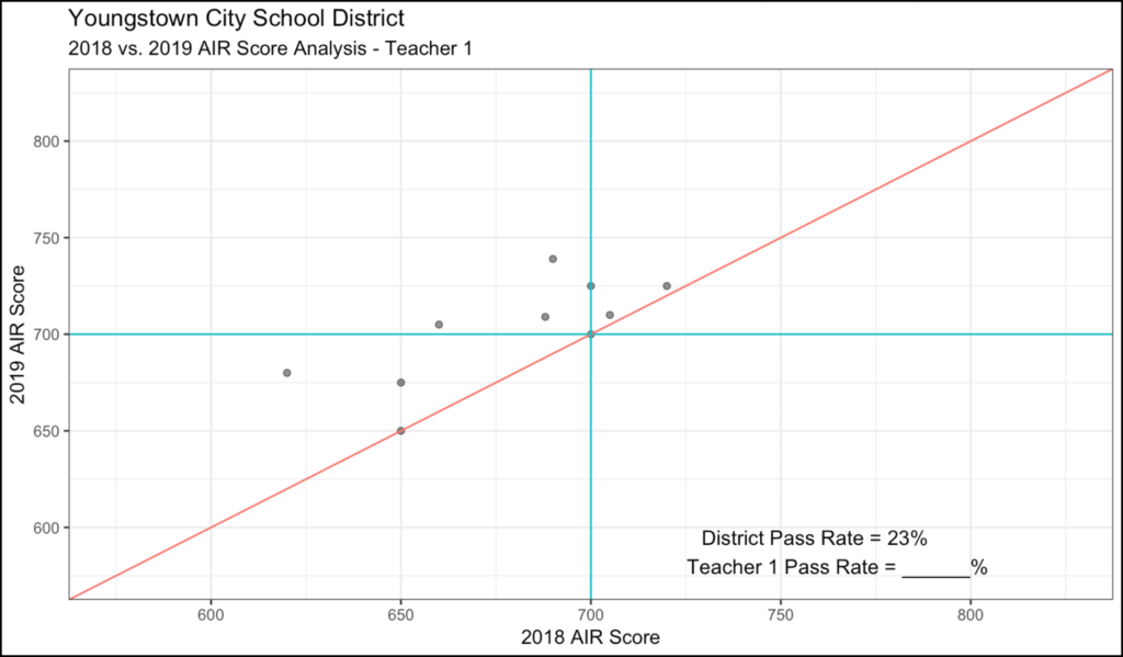
In this fictitious example, these 10 sample students have shown tremendous growth (all students above or equal to the red line) and tremendous proficiency (70% are proficient). When compared to the district pass rate of 23%, this is nearly 3x the average. You may not see this too often, but it’s nice to think about.
Teacher #2 – Low Growth / Avg Proficiency
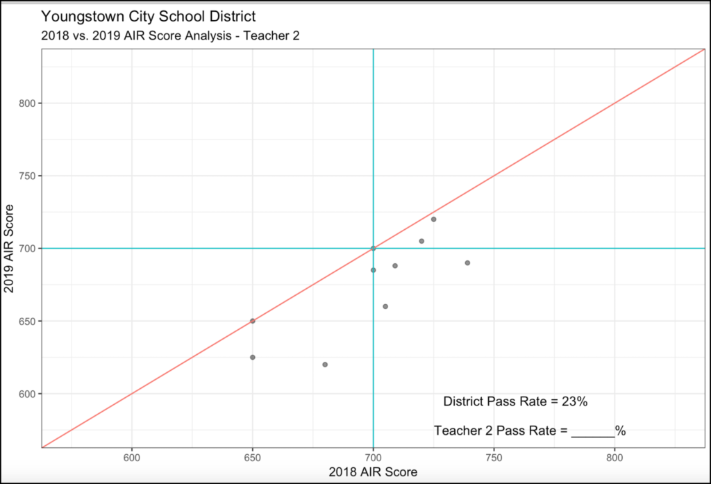
I include this example as a warning to teachers and administrators. While this teacher’s kids showed average proficiency (30%), every single student was either equal to or below the prior year’s score. This teacher inherited a class where 70% of the kids passed the test the year before, but only 30% passed this year. So while the proficiency score may not warrant investigation, the growth score certainly does. This is the danger of a single measure.
Teacher #3 – Mixed Results
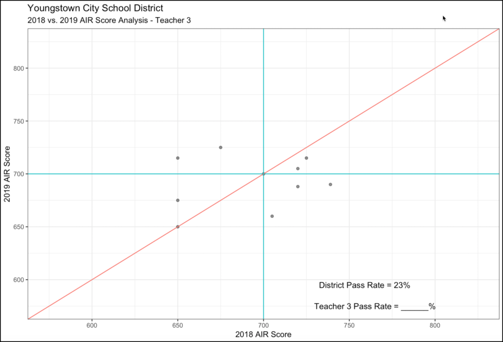
I include this example as a brain-teaser for the teachers. At first glance, the data looks all over the place. Good proficiency (50%), but growth seems to be mixed…some positive and some negative. But then I ask the teachers to see if they can see a trend in the growth data. If you look closely, the students who experienced positive growth in 2019 were those who were not proficient in 2018. Similarly, those that experienced negative growth were those who were proficient in 2018. So this tells us that this teacher may need some strategies in challenging their higher performers. Struggling students seem to do very well in this class, but higher performers tend to struggle. This is worth a discussion with the teacher about strategies.
Teacher #4 – The Danger of a Single Measure
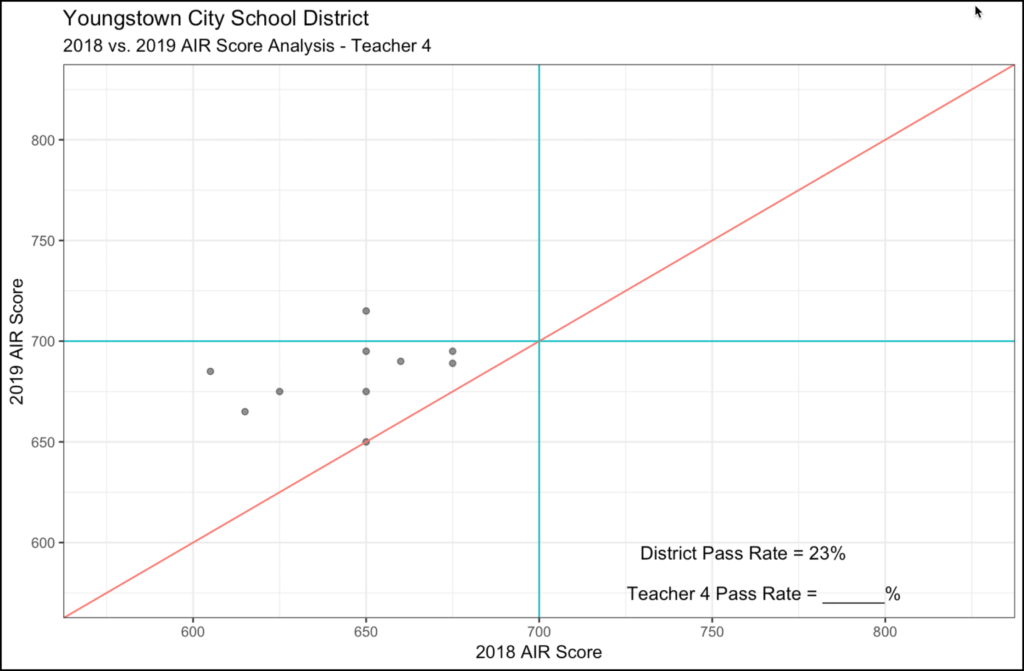
In this example, the pass rate of this teacher’s class is 10%, just one student was proficient, or just about half of the district average. In some systems, this may be cause for having this teacher placed on a “watch list” for poor performance. But look at growth! This teacher was able to show tremendous growth for students…with all of the students either meeting or exceeding prior-year results. Four of the students are within 5 points of passing. This teacher has done well with students despite the low pass rate.
Conclusion
In conclusion, it is very easy to focus on just one measure when looking at data, particularly in the area of assessment. As you review your prior year’s results with your staff, I would recommend that you add the growth measure to your discussion, rather than just focusing on proficiency. I think the review of both will do a much better job of telling the story of your school.